To recap - Project52 is the brainchild of Phoenix, AZ photographer Don Giannatti. This is his third year offering the program. The premise is that each week he posts an assignment to help you learn the world of commercial photography. Commercial photography involves taking pictures for advertising, marketing, brochures, etc. While it's not wedding or family portrait photography, it can involve portraits. The assignments that Don posts are real life examples of what commercial photographers are hired to do. They are due to Don by a specific date, and a few days later, he posts a critique of everyone's work to YouTube. He does this for free, but he also offers a more intensive Pro version for a fee where he gives more in depth feedback and individual attention. Obviously, I'm doing the free version since I'm ready to bail at any point.
And speaking of bailing, when I saw the first assignment I was ready to quit before I even got started. I'm pretty self-conscious in general when I have my camera with me in public (and even among family and friends), and on top of that, I'm an introvert. Now that doesn't mean that I'm not friendly, it means that I am not proactively friendly. So just the thought of asking a stranger if I could take his photo was enough to send my heart into palpitations. On top of that, I don't consider myself a portrait photographer. I shoot stuff. I pose things, not people. No, wait, I style. That's what it's called. Anyway, I can shoot a passable portrait if I have to and know what camera settings to use and all that but it's just not my thing right now.
Anyway, I was almost not going to go through with it, but then an opportunity dawned on me. For our next Girl Scouts meeting we had arranged to have a guest speaker. Each year, we celebrate the Girl Scout holiday called "World Thinking Day" by learning about another country. The girls had chosen to learn about Mexico, and one of the moms offered to ask a co-worker who had moved to the United States from Mexico if he would give a presentation.

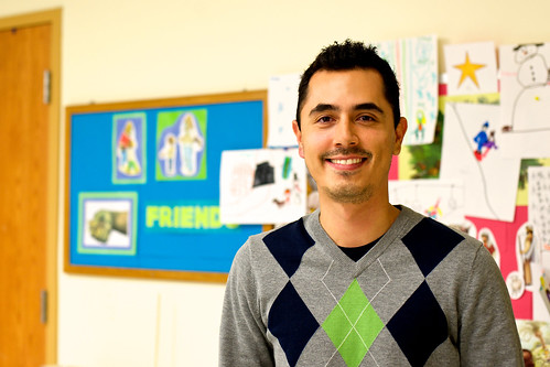
So here is Luis. Luis works in the IT department of a local grocery chain company. He's been living in the US for around two years, but his English is so polished that you probably wouldn't guess it. I cannot say enough how impressed I was by him. He brought his iPad along so he could show the girls photos and maps and completely tailored his presentation to the attention spans of 2nd and 3rd grade girls. You would have thought that he did this sort of thing all the time! The mom had mentioned that he was even a little nervous about giving the presentation, which made me feel better because I was certainly nervous about asking if I could photograph him! When he was finished, I asked if he minded if I took his photo for our troop scrapbook, which, while it was the truth, was also great excuse to get the assignment done. He agreed, and after a few seconds, it was over.

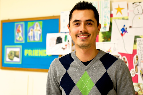
I tried to do a little planning ahead of time. I knew I would be up against ugly fluorescent lighting and busy backgrounds in the classroom where we meet. The classroom used to have a map of the world hanging on the wall, and I had planned to pose him in front of it. Of course, when I arrived I realized that the teacher must have taken it down. So I improvised and had him stand so that the word "Friend" would be in the background because we certainly made a new friend that day.
So what did Don think of it? Well, he said it was a solid portrait, but that I should have cropped out the door on the left because it was unnecessary information.

And of course, Don was right. When I cropped it originally, I was trying to keep him to the right of the frame as much as possible without losing all that cute artwork in the background. But it does look better this way, even if he is more to the center of the frame.
I promise not to be as wordy for the next few assignments because those are more in my area of expertise. :)


No comments:
Post a Comment